BOARDS DONE!!

So, I scrapped all my boards on Monday after the seminar and restarted, got them finished yesterday and printed this morning! I am a lot happier with how they came out, especially happy with the barcode on there that leads you to the website I have designed, so I am hoping people will actually scan it and have a look!

This is the bar code!

The finished boards

Images

I have gathered most of the images needed for the presentation, there’s only a few left to finish the presentation off. The theme of the presentation has stuck through with the colour orange and repeated photos over one another throughout.

I think it would be beneficial to include photos from the designer, so testing it alongside the images I already have in to see how they flow together will be the next step. I’m happy with the brand vision, mission essence, personality and values. Through the trends and the consumer profiles, I feel like theres too much information so it will run over the 5 minutes, but all the information seems relevant so cutting it down will be difficult.

Presentation.

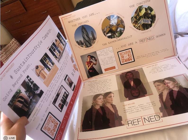
I have started the presentation, I have the majority of the content ready to be put on but a theme for the presentation is a struggle. I want it to look bold, powerful and experimental as that is what the brand is about, but also being refined and clean cut. Finding a balance is proving to be difficult.

With the logo and colour theme of the presentation, I have chosen the colour orange. Orange is known to represent independence, creativity and optimism. A lot of which the brand itself represents. Orange is also said to connect, it welcomes people with it being a warm colour, which helps to deteriorate barriers. Therefore I believe orange was the best colour to choose for the brand. Orange is therefore the colour ran throughout the presentation, but making it look bold and refined has been hard so far.

Designer.

Before the term ended for eater, I spoke with my designer to ask if she could send me progress she makes throughout the break so it can help me develop my overall understanding and ethos of the brand, however I haven’t received any yet, therefore within the next week of the break I am going to message her to ask to see any progress she has made. Hopefully some more insight will help me to develop the brand story.

Other brands.

I have started to research other brands that could be competitors, and have a look at the overall market where the brand will sit. The brands that I have researched are similar in style throughout but the prices for similar garments range quite a lot, therefore axis for the brand positioning may be difficult to do effectively. The main marketing points for my brand are how environmentally friendly it is for a luxury brand and how its main ethos is about empowering women and blurring the lines between masculinity and femininity. Therefore looking into the other brands and how I can compare them to my brand including axis around them could be the best way to go.

The consumer.

Both of my consumer profiles have developed and I believe I have a good insight for them both. Now I just have to develop a way to visually communicate the consumer. I have been experimenting with the logo as well, and I have a design I finally like. Now it is just to experiment with the colours and sizing of some of the letters, I have finally decided on the name refined, and have chosen a word logo to fit with this. Just the word refined as I feel it has a clean aesthetic to it, rather than a badge logo.

The brand story has been a struggle for me to start writing, but that is my aim to do within the next week.

So Many Trends.

I have been researching trends from LSN, there are so many that could relate to the brand in different ways, narrowing them down has been difficult, but I now have 3 that I could apply to the brand in some ways, just hopefully I have chosen the most relevant and affective ones.

I have played around with some logos for both the possible names but there hasn’t been one thats stood out or that I have really liked yet, so it is still a work in progress. I think the logo and getting the name right is one of the hardest parts to the brand but when it comes it will fit perfectly and suit the brand, so just waiting for that moment!